
These graphics were created for various projects over the last decade. Some were for client projects, some just for us.

Emissions reductions visualization for a project about airline industry CO2 emissions
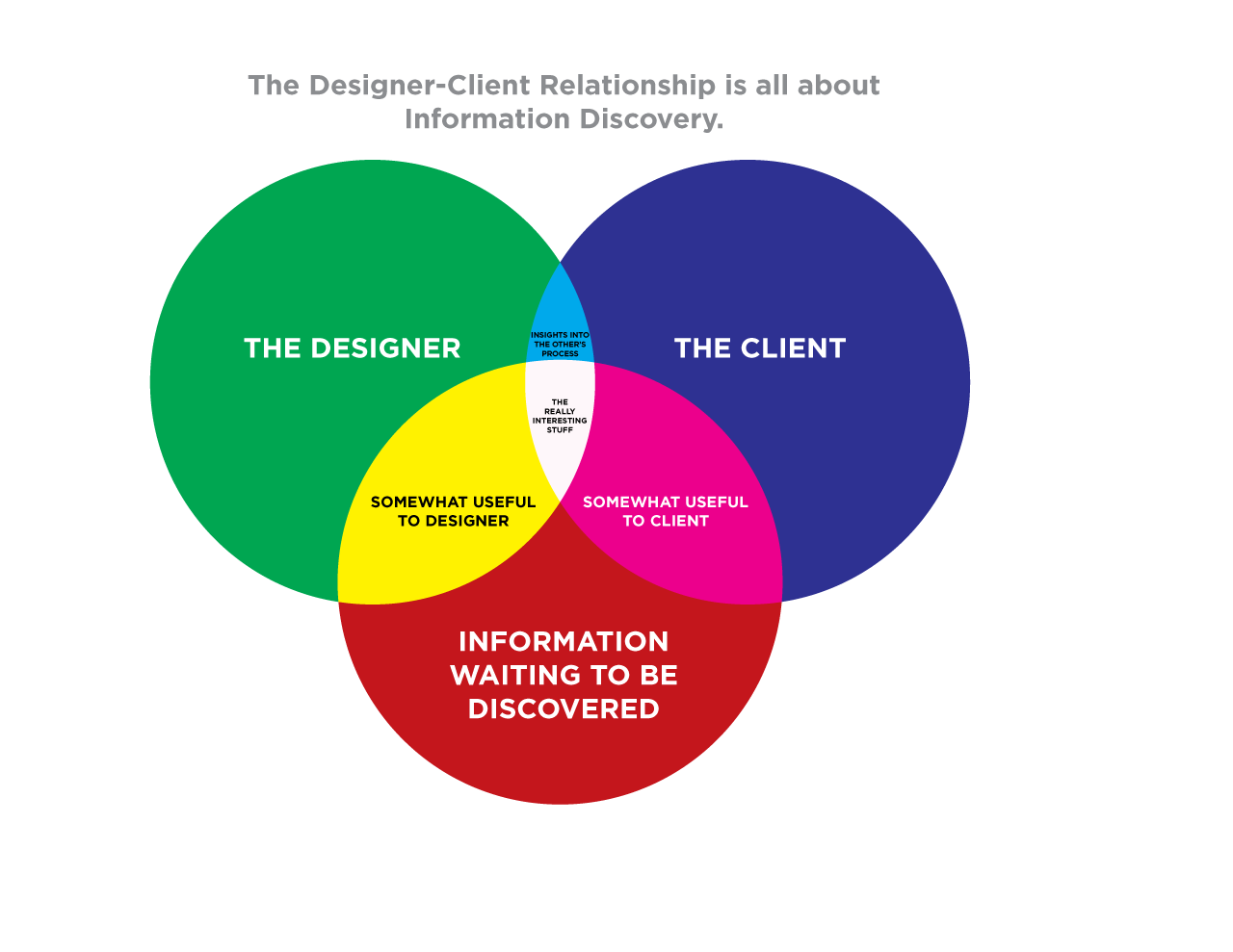
Venn diagram showing the ideal Designer/Client relationship. The really interesting stuff is always found in the center.

A chart showing relative 2008 presidential campaign contribution amounts from the creative professions.
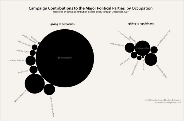
A monochromatic chart showing relative campaign contribution amounts, by creative profession.
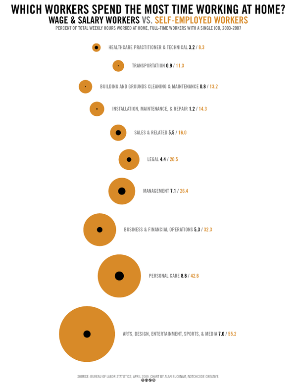
A chart highlighting the different amounts of time people work from home, versus working at the office.
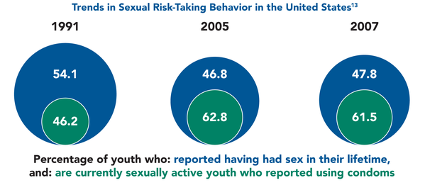
Sexual Risk-Taking in the United States Chart, for a Human Services nonprofit client report, 2009.
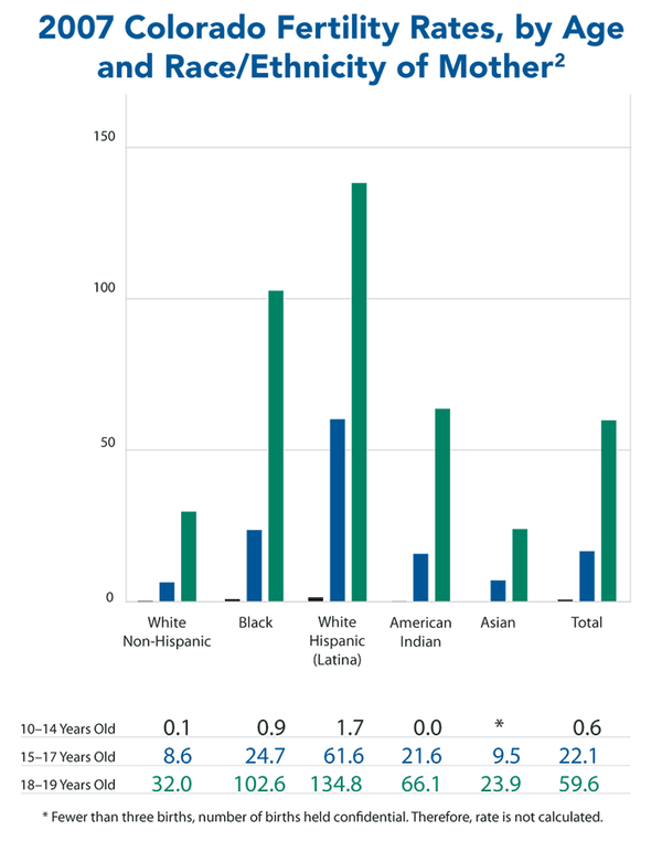
Fertility Rate Graph by Age/Ethnicity of Mother, for a Human Services nonprofit client report, 2009.
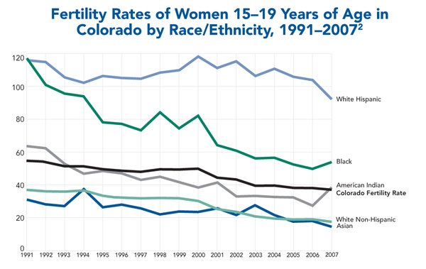
Graph showing changes in fertility rates of teens in Colorado over time, differentiated between race/ethnicity; for a Human Services nonprofit client report, 2009.
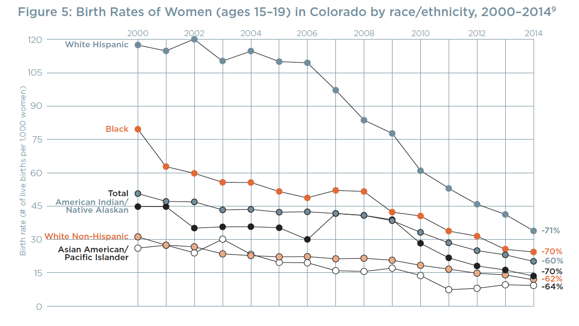
Another graph showing changes in birth rates for the same client, created several years later, reflecting a more refined and updated visual language.

Comparative graph showing infection rates of two STDs in the national and state populations; for a Human Services nonprofit client report, 2009.
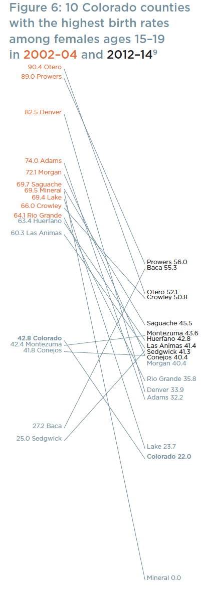
A slopegraph showing shifts in which Colorado counties had the highest teen birth rates, ten years apart.
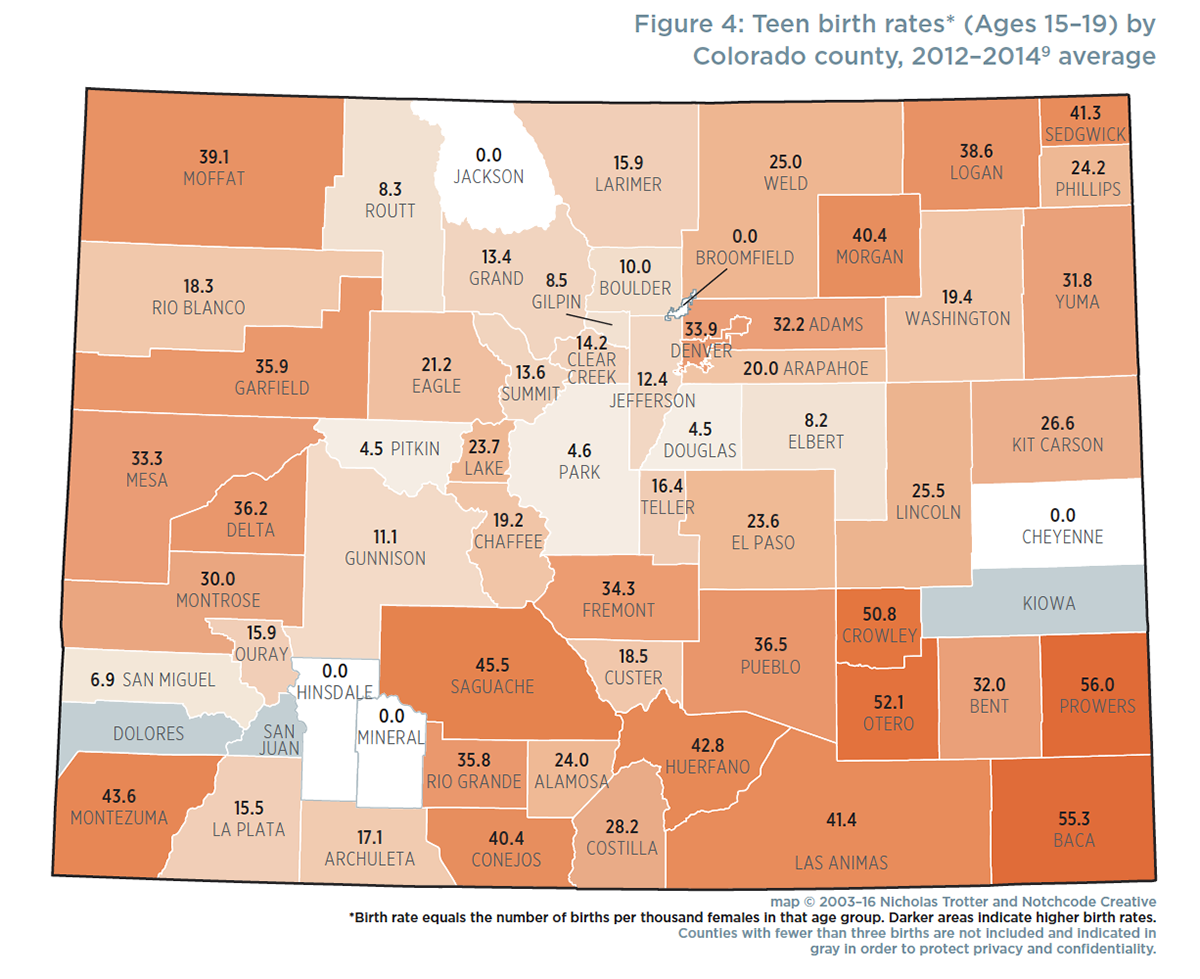
A choropleth map showing teen birth rates by county in Colorado. We used an algorithm to place the highest rate color at 100% opacity, and the lowest rate at 12% opacity.
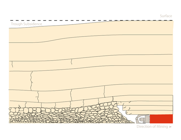
Longwall coal mining cross-section diagram showing trough subsidence; for a government client, 2006-09.

Coal mine roof cave-in cross-sectional diagram; for a government client, 2006-09.
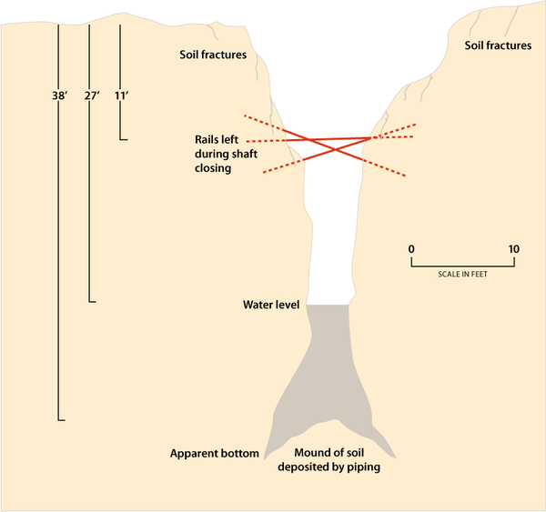
Coal mine shaft cross-sectional diagram; for a government client, 2006-09.
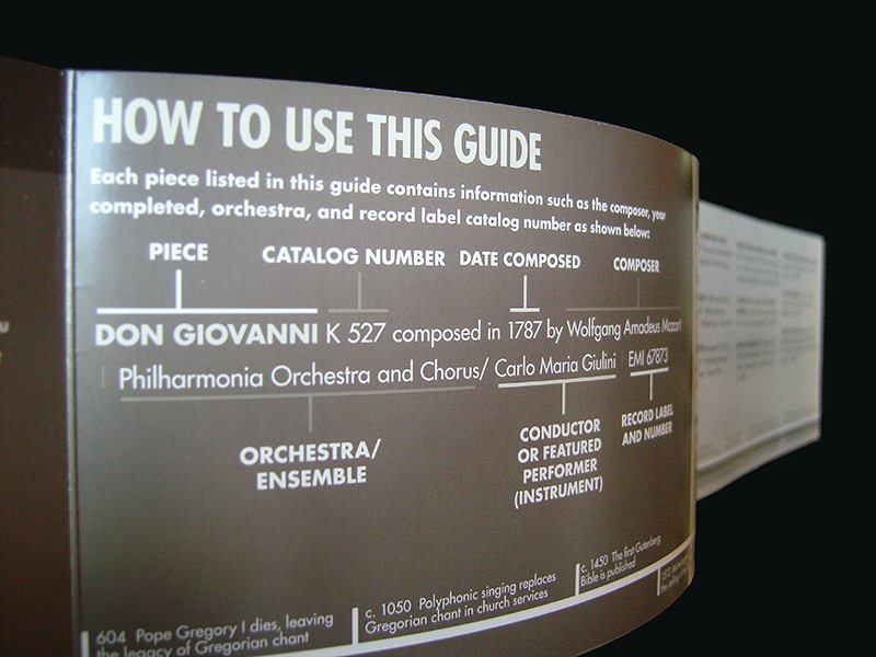
Detail from a guide to essential recordings in classical music. See the whole project here.